Contriibia
Designing a Trusted Group Savings App
Type: End-to-end Mobile app
Role: UX & UI Designer and Researcher
Tools: Figma, Zoom, Notion
Duration: 2 months

Background
Our collaboration began when founders Shakir and Lateef approached our UX team with a mission deeply rooted in cultural heritage: to digitally preserve and enhance the centuries-old tradition of Rotating Savings and Credit Associations (ROSCAs).
Having witnessed firsthand how these community savings circles fostered trust and provided critical support for life milestones and unexpected hardships, they also recognized systemic challenges, security vulnerabilities, member reliability issues, and cumbersome manual tracking.
Through immersive stakeholder interviews and contextual inquiry, we gained profound empathy for both the communal value of ROSCAs and the frustrations users faced.
Design Thinking Framework
Our Human-Centered Approach
We applied the Design Thinking framework to transform an ancient financial tradition into a secure digital experience
Empathize: Deeply understand trust/security concerns through user interviews and competitive analysis.
Define: Synthesize core challenges around group dynamics & financial transparency.
Ideate: Generate inclusive solutions through collaborative workshops.
Prototype: Build user flows focused on security and simplicity
Test: Iteratively refine through multiple usability sessions.

This structured approach guided our market investigation, ensuring every design decision would address real user needs in a competitive landscape.
Competitive Analysis
By mapping out key strengths and gaps across major competitors, we uncovered insights that shaped our product positioning and design decisions.

Key Insights from Competitive Analysis
We audited 9 direct and indirect competitors in communal finance to identify market gaps and differentiation opportunities for Contriibia:
1. Trust is a major barrier.
Many existing apps focus on digitizing traditional systems (Pardna, Asusu), but they often feel risky to mainstream users.
Platforms that succeed (like SoLo Funds or Esusu) tie their model to credibility (credit reporting, lending transparency).
2. Group savings is often misunderstood.
User research showed people were hesitant and confused by the concept.
Competitors reinforce this by either burying group savings as a secondary feature (Esusu) or presenting it in ways that feel niche or informal (Pardna, Asusu).
3. The opportunity lies in reframing.
By presenting group savings not as an “old” system but as modern, empowering, and community-driven, we can highlight its value in a fresh way.
Bloom hints at this approach with gamification, while there’s room to strengthen trust-building elements to fully engage users.
4. Differentiation = blending trust + usability.
None of the competitors fully combine trust-building (e.g., credit reporting, fraud protection) with a delightful, user-friendly experience.
This is where Contriibia can stand out: reliable like Esusu, but engaging like Bloom.
While the competitive analysis gave us initial insights into features and trust signals, it also highlighted a key question: would potential users feel confident using a group savings app? To answer this, we turned to user interviews to understand their concerns, motivations, and expectations around safety, transparency, and collaboration.
User Interviews
To gain a deeper understanding of our users, we conducted interviews with potential participants across the US and Canada, representing both Latin American and African backgrounds as well as North American-born individuals. We synthesized these insights using an affinity map to uncover key patterns and themes.
These interviews revealed that while group savings holds strong potential, it remains a new and sometimes confusing concept for many users. Participants expressed hesitations about trying it without clear benefits, visible trust signals, and reassurances around financial security.
Key Insights from User Interviews
Our user interviews revealed that while group savings has potential, it’s still a new and sometimes confusing concept for many participants. Users were hesitant to try it without clear benefits, trust signals, and reassurance about financial security.
Value Proposition:
Social accountability matters: 75% of participants, who had been part of savings groups in the past, preferred group savings because it helped them save more consistently than on their own.
Financial flexibility: 50% valued faster access to funds in emergencies.
Users need a clear explanation of why group savings is better than solo saving and how it aligns with their goals.
Trust & Collaboration:
Users don’t need to know others personally; if the system itself inspires confidence, they’re willing to try saving with people they don’t know. Trust in the process is enough for them to give it a chance.
Hesitations & Pain Points:
Users worry about trusting their money, being “locked in,” or losing access in emergencies.
Concerns exist around group order disputes, leaving groups, and overextending financially.
App Adoption:
Security, transparency, and legitimacy are non-negotiable for users to adopt a digital platform.
Platforms must provide clear communication, strong privacy assurances, and visible fund safety measures to encourage users to transition from informal practices, such as pooling money with friends and family without any formal oversight.
Understanding current habits and informal systems (e.g., WhatsApp or Excel tracking) informs potential design solutions.
What we learned from the user interviews shaped our core persona and helped us define clear design opportunities.
Persona
Synthesizing these patterns allowed us to bring our user to life through one detailed persona, ensuring our solutions remained deeply human-centered and grounded in real needs.
“I want a platform that makes saving easier and safer - something I can trust, with people I know will come through”
After conducting our research, we discovered that many users were unfamiliar with the concept of group savings and hesitant to try it.
While the market opportunity wasn’t immediately clear, the CEOs were passionate about moving his vision forward. We saw this as an exciting challenge and collaborated with them in a brainstorming session to reframe the app in a way that felt valuable and approachable for users.
From that process, we generated a long list of potential features that addressed both user needs and stakeholder goals, features that we later prioritized to define the scope of Contriibia’s MVP.
Feature list
Tutorial Process
New User Registration
Linking Bank Account
User Profiles
Group Creation + Joining Functionality
Automatic Contribution Functionality
Automatic Payout Functionality
Transaction History
App FAQs / Learning Hub
Customer Support + Help Center
Real-Time Notifications
Group Communication Features
Flexible Payout Order Functionality
Multiple Language Support
Goal Setting Features
Gamification and Incentives
Personalized Savings Recommendations
Credit-Building Services
Financial Educational Resources
Financial Consulting Services
Feature Prioritization
Our user interviews revealed a significant adoption barrier: newcomers lacked a North American credit history. This critical insight surfaced a missing, high-value opportunity. During our prioritization exercise using the MoSCoW method, the credit-building feature was decisively classified as a 'Must-have.' We determined it was not just an enhancement but critical for the product to work and deliver core value to our target users, especially those new to establishing a financial history.
This framework was instrumental in aligning the team and the CEO on what was essential for launch. It allowed us to confidently prioritize this user-validated feature while logically organizing other ideas into 'Must', 'Should, 'Could' and 'Won't have' categories for future iterations."
After prioritizing key features, we mapped out Contriibia’s primary user flows to shape the app’s structure. We organized essential actions into a clear, streamlined sitemap to keep the experience intuitive and easy to navigate.
Sitemap
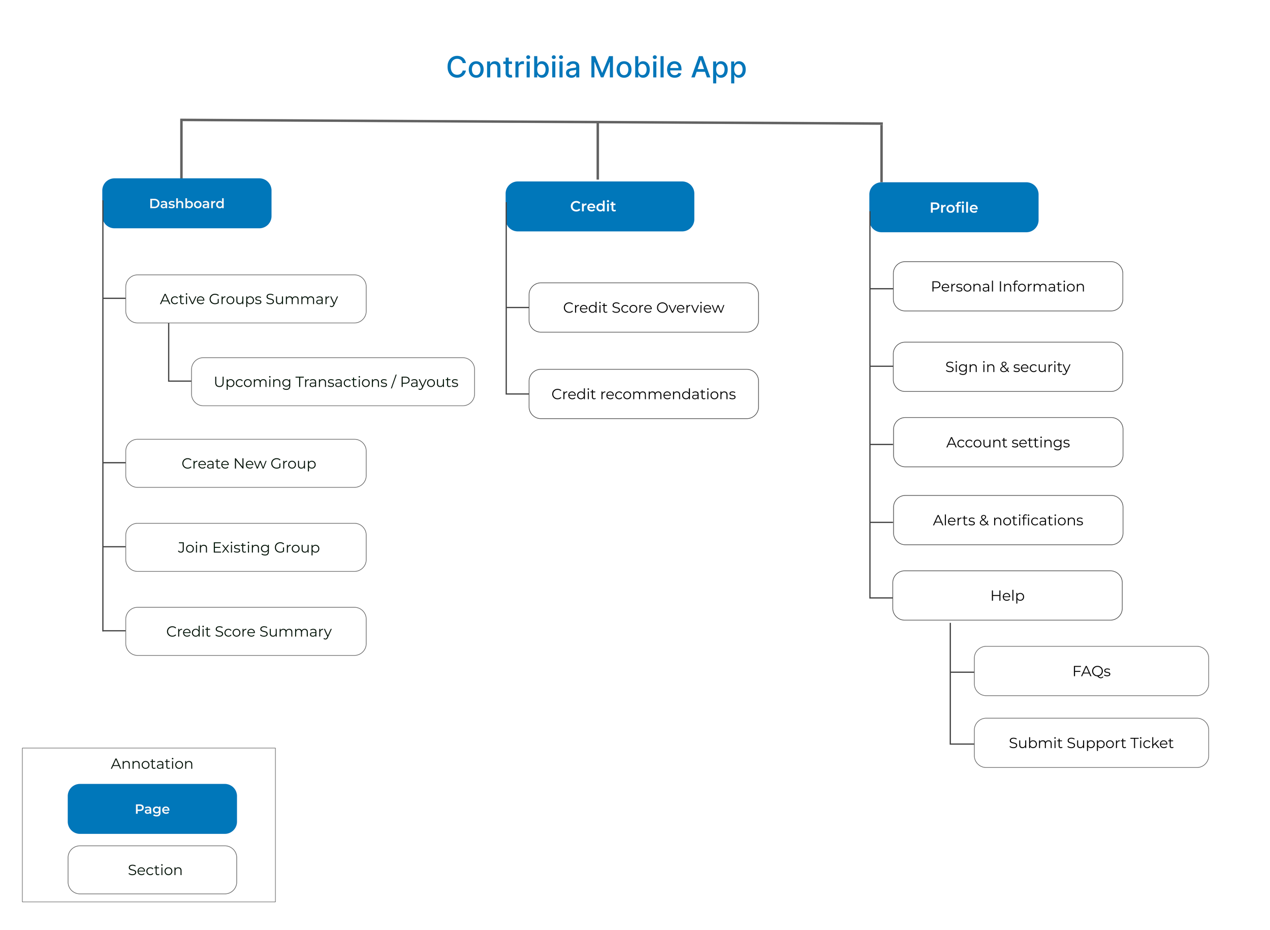
To make this feature intuitive and accessible, we gave credit tracking its own dedicated tab within the app. This design choice reflected our users' desire for clarity and control as they built their financial profile. By surfacing credit progress as a primary navigation item, we aimed to encourage continued engagement and reinforce a sense of ownership over their financial growth.
User Flow

The core user flow begins with login or account creation, followed by setting up a user profile. Once onboarded, users can create or join savings groups, enabling collaborative goal setting and shared financial progress from the start.
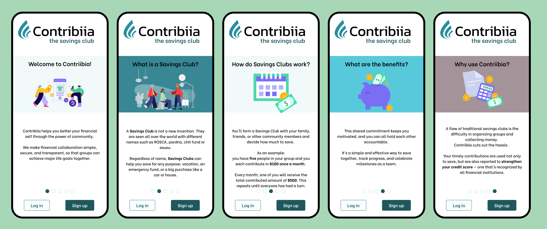
After mapping the structure and user flows, we were ready to move into low-fidelity wireframes to visualize the core interactions for the app.
Low Fidelity Wireframes
With the low fi wireframes, we designed limited screens because we wanted to test and draw conclusions before spending more time and resources on the final version.
We were aiming to know if users understood what group savings were, it the process of creating an account was easy and if the process of creating a group was understandable. We knew trust was a big theme overall, so we added some screens with user ratings and the additional credit score feature to see if that would motivate users to use the app.
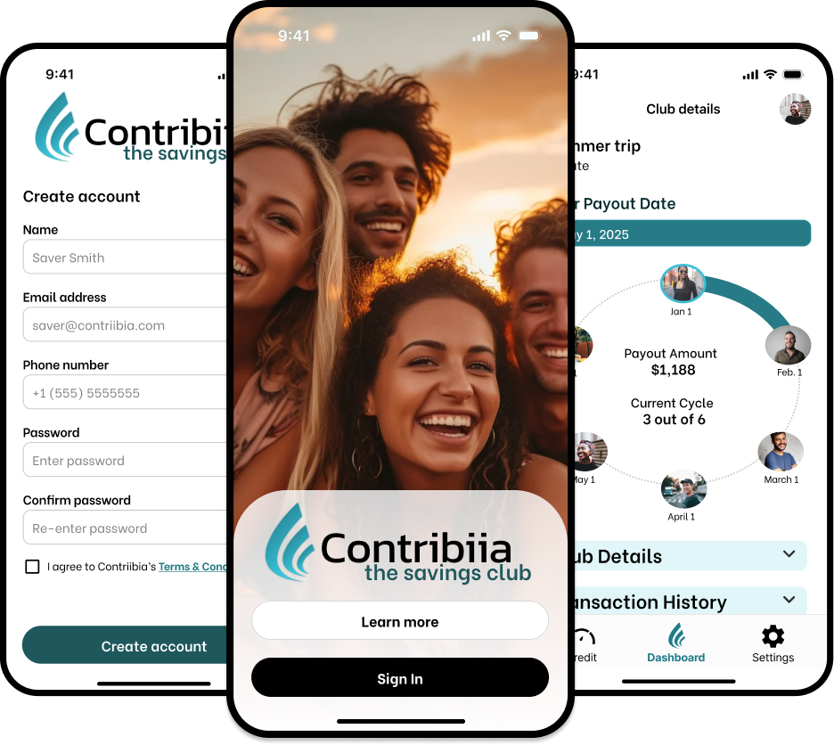
Sign-Up:
Tutorial process:
We knew that many users would be unfamiliar with group savings, so we designed a tutorial process that clearly explained the app’s purpose, benefits, and functionality. We also emphasized user safety through regulations and transparency.
Group Creation:
Creating a savings group should be as easy as sending a text. We designed an intuitive flow that allowed users to set up groups quickly and manage them with ease. And once again we focused on building trust along the way like public groups only creators can share with who they want and public groups you can look into before joining.
One of the worries about this type of savings was that nobody would want to be the last to join because they would be the last to receive them lump sum of money, so we decided to make the group turns random when joining the circle and members could talk to each other to exchange places if they wanted

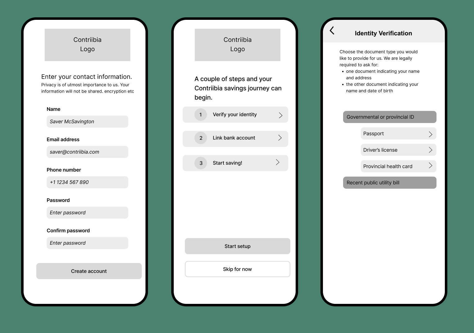
The sign-up process needed to be secure yet simple. We minimized the number of screens and used clear, easy-to-understand steps to build trust from the very beginning. We also wanted to test if these security steps could ease the concerns users had around trusting the app.
We added the option to skip the account creation on the second screen to allow users to see how the app works, scroll through the groups and see members profiles, so they can confidently make the decision to join. This was another way of creating trust.

Credit Score:
The credit score gauge gives users a clear, at-a-glance view of their current score. It's easy to understand and reinforces progress by showing how on-time payments in Contriibia contribute to steady credit improvement.

Low Fi usability testing
Methodology:
Participants:
5 young adults with a strong interest in personal finance and savings. Mixed familiarity with group savings
Format:
Moderated sessions conducted both remotely and in person, using a new set of participants (distinct from previous interviewees).
Tasks:
Complete tutorial
Sign up for an account
Create a savings group

Key Research Insights
User testing on the low fidelity wireframes confirmed that our core design was overall easy to navigate, however, several areas need refinement:
Tutorial: Clear overview built trust, but users were unsure when or how they’d receive their money. The credit score feature stood out as a strong motivator.
Sign-up Flow: Users hesitated to share financial data before understanding the app’s value. Adding trust signals and transparent explanations could reduce friction.
Group Creation: Confusing terms and low trust in public groups led users to prefer private groups — guiding the team’s decision to focus the MVP on that experience.
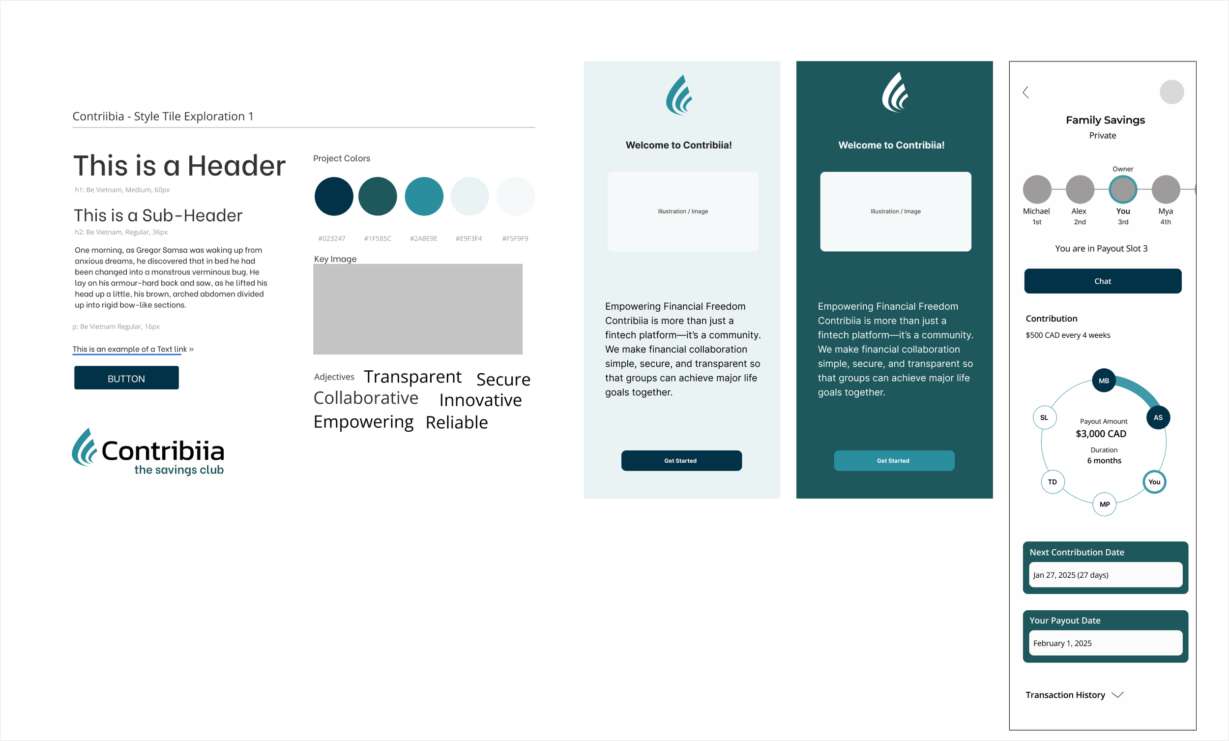
Branding
After several meetings with the CEO, we reached the conclusion that the goal for this design was to make an app that felt modern, trustworthy, and approachable, while also giving people the credibility of a trustworthy financial institution that would be responsible with their money.
We started the process looking for inspiration from other financial companies that used illustrations to make their approach more user friendly and easier to understand through images rather than just words
Inspiration

Brand Identity & Design Rationale
Every visual choice aimed to make finance feel more human and inclusive
The color palette and overall tone evoke calm and trust, reinforcing a sense of community
The identity moves away from the formal aesthetics of traditional banks, introducing warmth and approachability instead
The result is a modern, adaptable system that reflects Contriibia’s mission of collaboration, transparency, and shared growth
After exploring several palettes with the CEO we decided to move forward with lighter blues, complemented by different shades of blue across buttons, illustrations, and other key elements. This choice reinforced a sense of calm and trust while keeping the interface modern, cohesive, and aligned with Contriibia’s approachable yet credible brand identity.
Logo

Logo Exploration & Concept Development
Explored multiple visual directions to represent collective savings, including:
Circles → symbolizing community and unity
The letter “C” → referencing the brand’s initial
Wave-inspired forms → expressing motion and growth
Final Logo Mark
Combines these elements into a cohesive symbol:
Circular curves evoke community and support
Flowing shape suggests growth and forward movement, like ripples or a sailboat
Typography Choice
Selected a rounded, modern typeface to reinterpret the idea of a traditional savings circle
Contrasts with the rigid, serif fonts often used by banks
Communicates flexibility, openness, and trust while maintaining a professional yet approachable tone
The selected logo proved to be the most adaptable and the strongest visual expression of Contriibia’s values of collaboration and progress. We added the tagline “the savings club” to reinforce the brand’s sense of community and collective growth.

Inspired by brands like Bloom, Lemonade, Chime, Pardna, and Lemfi, Contriibia adopted a design language that makes finance feel approachable and human. These brands showed that even complex financial decisions can feel simple and empowering. Contriibia built on that vision to create an app that felt modern, trustworthy, and approachable, making finances less intimidating while maintaining the credibility of a responsible financial institution.
Choosing colors
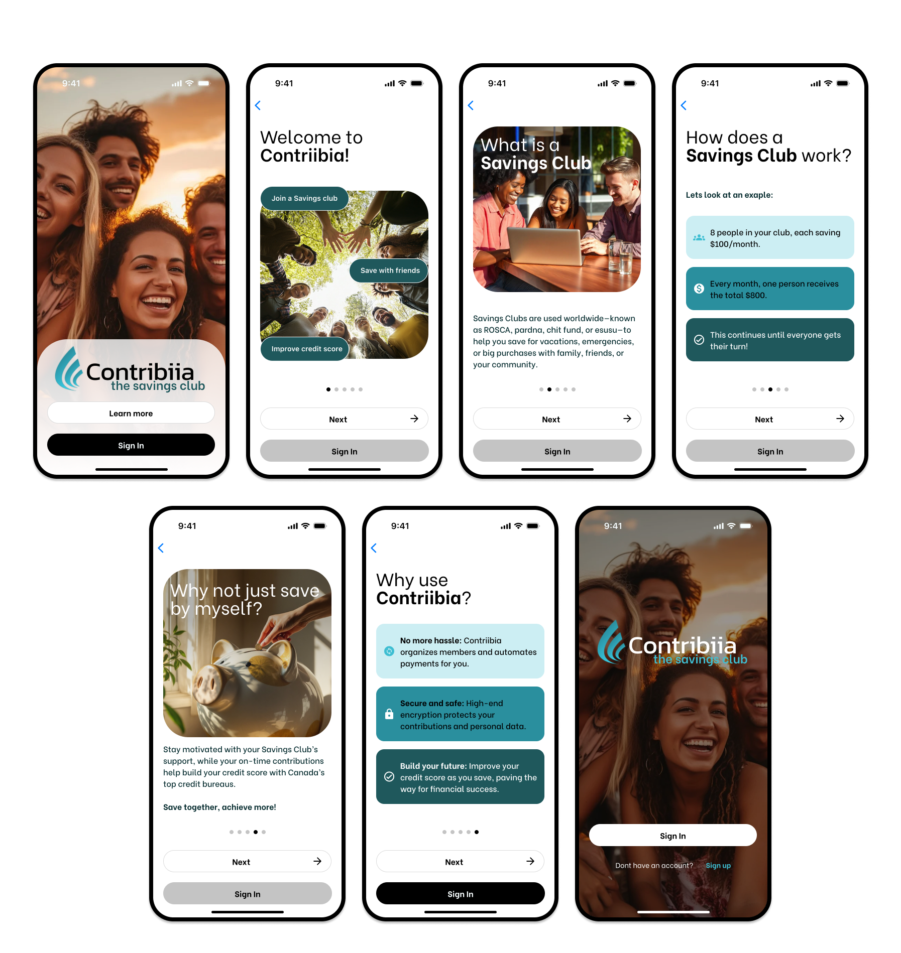
With the core structure established and branding approved by the client, we moved into high-fidelity mockups.
Hi Fi Wireframes
Sign up
For the signup we aimed to:
Make the sign-up process as short and simple as possible
Ensure users felt safe and protected when sharing personal and financial information
Clearly communicate the app’s security standards, especially when uploading documents or connecting a bank account one of the main trust concerns identified in testing
Build user confidence by allowing them to save and continue with account creation later so they can explore the app first, giving them control before deciding to finalize their account
Group Creation
We had some clear goals for the tutorial section:
Clearly explain what a savings circle is in a simple, approachable way
Address trust concerns by highlighting key safety measures
Keep content concise and easy to digest to ensure a smooth first-time experience


Credit Score

To help users better understand and improve their financial health, we enhanced the credit score feature with:
Month-over-month progress visualization: A clear, simple graph showing how consistent on-time payments made through the app contributed to steady score improvements.
Personalized improvement tips: Contextual suggestions to help users understand other factors influencing their credit scores and take actionable steps.
Credit card recommendations: Tailored offers aligned with each user’s score and profile, designed to feel helpful rather than promotional.
While the monetization aspect—partnering with credit card companies to offset app fees—was beyond the UX scope, we identified it as a future opportunity to make the experience sustainable and free for users.
For this section we had the goal of making it simple and intuitive for users to start or join a travel group. Users could:
Create a new group and customize key details like number of members and contribution amount
Join a public group if they wanted to save with other people on the app
Join a private group through an invitation link.
The flow also introduced optional insurance, presented in plain, reassuring language to help users make informed decisions without feeling pressured. Finally, we ensured transparency around platform fees, detailing exact payout amounts and fees to build trust and prevent any last-minute surprises.
Tutorial
To ensure our designs continued to align with user needs, we conducted a second round of usability testing using high-fidelity mockups.
Hi Fi Wireframes Testing
Participants: 5 young adults with a strong interest in personal finance and savings. Mixed familiarity with group savings
Format:
Remote, moderated usability sessions.
✅ What Worked
Tutorial, sign-up and group creation tasks were all completed successfully.
Group customization option and credit score improvement were seen as reasons to use the app
The app was intuitive and easy to navigate.
⚠️ Pain Points
Tutorial navigation and scrolling were confusing for some users.
Users struggled to understand the relationship between the logo tagline in the tutorial and the product offering, especially the distinction between “groups” and “clubs.”
While users stated they understood the tutorial, later tasks revealed gaps in comprehension, suggesting the information wasn’t fully internalized.
Dashboard lacked clarity and they wanted to see contributions and group progress.
Some users thought the credit score benefit wasn’t well explained in the tutorial flow
Users thought the design was too childish or unserious, and make them not trust the app because it didn’t look like the financial apps they were used to
🔧 What to Improve
Enhance app look and feel to march user expectations of financial apps
Users needed clearer navigation in the tutorial, so we had to make the scroll behavior more explicit to help them feel in control.
Add progress indicators to the groups on. dashboard so users can track their progress
Clarify credit score with transparent, user-friendly explanations.
Because testing revealed that our users preferred a more serious tone, we updated the design accordingly to strengthen the app’s modern look and overall trustworthiness.
Implementing Feedback & Finalizing the Design
Tutorial:
Clarified tutorial language to make the app’s benefits and community value more immediately understandable.
Improved navigation by enhancing carousel indicators, adding clearer buttons, and incorporating supportive visuals that guide users through each step.
We used a clear grid system to ensure consistency, alignment, and visual hierarchy across screens, helping create a more polished and cohesive experience.


Savings club creation:
By clarifying contribution and payout dates and insurance terms, we helped users feel confident in their financial commitments.
We also added progress tracking for their groups, making the overall process easier to understand.
Sign up:
By using color to distinguish content types, improving readability with bullet points, adding icons for clarity, making task progress more visible, and incorporating trust-building language.

Credit Score:
We updated the visual style to feel more modern and cohesive, helping users immediately recognize key improvements.
We improved the placement of the “Improve Credit Score” button so it’s easily accessible, and made credit card offers more explicit and easier to compare at a glance.

🌟 The Outcome: A Strong Foundation
The final MVP prototype was well received by the CEO, as it successfully addressed core user needs, prioritized trust and clarity, and laid a solid foundation for future growth.
While a major milestone, it was just the beginning, with the client planning further enhancements to strengthen Contriibia’s market presence.
🚀 What’s Next?
While the MVP is a strong starting point, there are exciting opportunities ahead. Future iterations could focus on:
Keep developing trust:
Continue building trust by adding more indicators around data protection and credit features to continue building trust and increasing user confidence.
Credit Building as a differentiator:
Promote credit building as a key benefit of the app, so users recognize Contriibia as a partner in improving their credit and accessing new financial opportunities
Increase user acquisition
Position club saving as a viable way to access a loan, motivating more people to join and use the platform
I’m excited to see how Contriibia will continue to evolve and proud to have helped lay the foundation for its journey.
Reflection
This project was a valuable learning experience that helped me grow both as a designer and as a collaborator.
A pivotal moment came when our initial user research revealed that the core problem the CEO wanted to solve was not a primary pain point for our target users. Rather than seeing this as a setback, we framed it as a crucial opportunity.
By presenting our findings with empathy and focusing on the shared goal of product success, we were able to align stakeholders around a different, more validated user need, ultimately saving the project from building a solution in search of a problem.
What I learned:
The importance of defining scope and prioritizing features when building an MVP, while aligning stakeholders around core user needs to accelerate testing and iteration.
The value of clear, empathetic communication, especially when working with clients new to UX/UI.
How to turn challenges into opportunities: when user research didn’t fully validate the CEO’s initial vision, we used the insights to reframe the problem, brainstorm collaboratively, and identify features that delivered real value to users.
How to collaborate effectively with other UX designers: by dividing tasks based on strengths, presenting work cohesively as a team, and leveraging my own skills, an experience that strengthened my confidence and prepared me for future cross-functional projects.