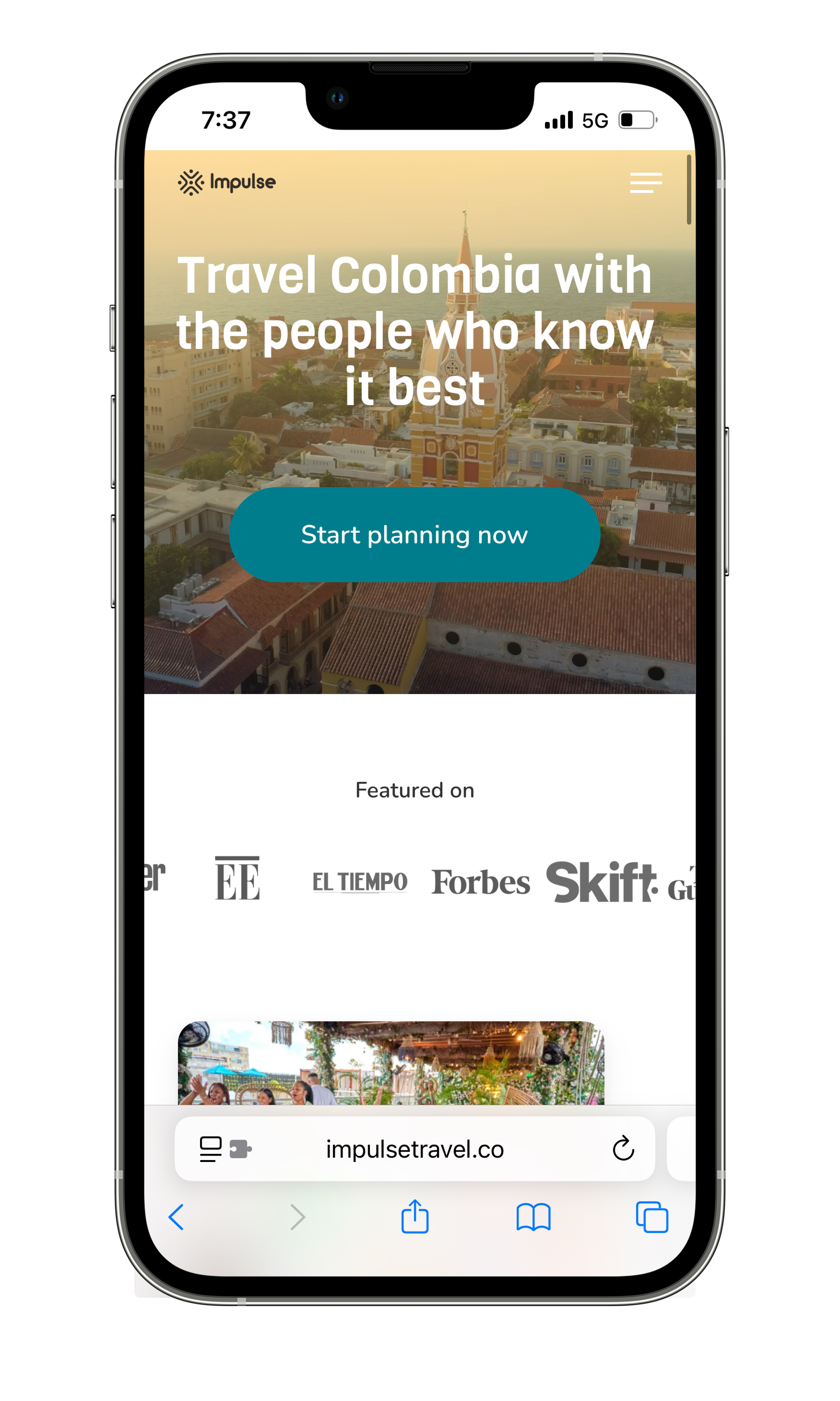
Impulse Travel

Type: Responsive web design
Role: UX & UI Designer and Researcher
Duration: 6 weeks


Background
This case study focuses on identifying and resolving responsiveness issues in Impulse Travel’s existing website. Instead of redesigning the site, I performed an expert review focused solely on responsiveness, where I identified key layout inconsistencies and device-specific problems. These early insights helped define the core problems affecting cross-device usability.
To gain a deeper understanding of these issues, I expanded the process by conducting user interviews to validate the pain points, perform competitive analysis, and map user flows to better comprehend behaviours across devices. I then devised a revised layout structure, rethinking grid systems, spacing, margins, and component scaling, all while considering how visual direction and alignment influence responsive behaviour. From low- to high-fidelity prototypes, I made targeted UI adjustments to maintain design integrity while addressing real responsiveness issues. Usability testing confirmed that the new structure provided a consistent, accessible, and user-friendly experience across both desktop and mobile platform.
Design Thinking Framework
I followed the Design Thinking framework to structure my process.
Empathize: understanding pain points in multi-device experience through user interviews and analyzing how leading brands handle responsiveness through a competitive analysis.
Define: Mapping key issues and prioritizing responsiveness issues to solve
Ideate: sketching solutions for a responsive user experience
Prototype: Aligning design experiences through grids, cards and consistent spacing
Test: Iteratively refining through user testing feedback

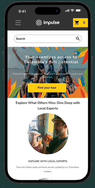
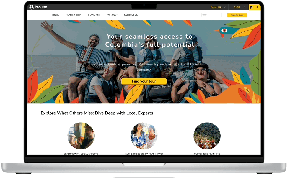
My journey began with a quick Expert evaluation of Impulse Travel's website, where I identified multiple usability issues across both desktop and mobile platforms. Recognizing significant improvement opportunities, I embarked on research to deeply understand the problems better so I could develop impactful solutions
Expert Evaluation
From my evaluation I found the following Key mobile issues include:


While the mobile expert review exposed performance and responsiveness gaps, a dedicated desktop review surfaced complementary usability and structural issues that compounded the inconsistencies across platforms.
Desktop Issues
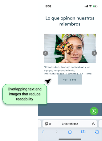
A. Layout & Readability
Disjointed grid structure led to inconsistent content alignment, with overlapping or truncated elements on mid-sized viewports.
Typography failed to scale across breakpoints, often rendering headers too large or body text too small for comfortable reading.
Content containers lacked flexibility, causing horizontal scrolling or clipped information, especially in dynamic sections like itineraries.
B. Pop-ups & Overlays
Pop-ups appeared abruptly, often without context or clear dismissal options, interrupting task flows.
Overlay modals blocked scroll access, trapping users in certain areas without intuitive exits or back navigation.
C. Navigation & Interaction
Navigation patterns were inconsistent, with the hamburger menu behavior differing between pages or becoming unresponsive after scrolling.
Tap and click targets were undersized, especially in filter bars and form buttons, making interaction frustrating even on larger screens.
Hover-dependent elements (e.g., tooltips or dropdowns) lacked fallback behavior on touch-enabled desktop devices.
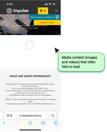
D. Media & Performance
Images were not optimized, loading large, high-resolution assets even on smaller screens or slower connections.
Auto-playing videos degraded performance and distracted from core content, particularly on landing pages.
E. Forms & Functional Inputs
Form fields triggered unexpected zooming, especially in modal views or embedded components.
Lack of input guidance resulted in frequent user error and abandonment. Labels were either too vague or missing entirely.
Submission feedback was unclear, creating uncertainty whether actions (like bookings) were successfully completed.
With those issues in mind, I knew I needed to dive deeper into these usability issues, so I started the Empathize phase with a user interviews to understand what were users main pain points when navigating and purchasing travel products on Impulse’s website
User Interviews

With the goal of identifying and resolving mobile usability on Impulse Travel’s website in order to ensure a seamless, engaging, and conversion-friendly experience across all devices, I started the user interviews. I wanted to:
Evaluate current mobile usability pain points in navigation, responsiveness, and task flows.
Identify user expectations for mobile travel booking experiences.
Validate redesign solutions through iterative testing.
I conducted a usability test interview with five participants, asking them to complete key tasks across both desktop and mobile devices. After gathering numerous insights, I organized and synthesized the findings using an affinity map to identify recurring themes and pain points
While user interviews provided valuable insights into general usability challenges, they revealed little about the technical origins of the responsiveness issues, which were likely rooted in earlier design or development decisions. Still, the process helped me validate interface expectations and guided me through meaningful iterations to improve the cross-device experience.
Key Insights:
Mobile Layout Breakdowns
Content overflow, misaligned grids, and awkward scaling on smaller screens.
Inconsistent Cross-Device Design
Discrepancies in button labels, component states (e.g., hover vs. tap), and visual hierarchy.
Poor Touch Interaction
Users struggled with small/unresponsive tap targets and accidental triggers (e.g., carousel swipes).
Static Desktop Elements on Mobile
Non-adaptive filters, forms, and modals forced pinch-zooming or horizontal scrolling.
Next, I carried out a competitive analysis to understand how other top travel platforms approached responsive design. This allowed me to identify best practices and design conventions that informed my own layout adjustments.
Competitive Analysis

A competitive analysis benchmarking Impulse Travel against Colombia’s leading travel platforms, Awake, Roadtrip, and Colombia Oculta, revealed significant gaps in responsiveness, particularly on mobile, where Impulse consistently underperformed industry standards.

Competitor Advantages:
The Competitive Analysis revealed that Impulse Travel’s lack of a truly responsive design and mobile-friendly UI placed them behind key competitors like Awake and Rodtrip, both of which offered seamless cross-device booking. The mismatch between their desktop and mobile experiences likely contributed to their struggle to dominate Colombia’s travel market, though further research would be needed to confirm this correlation.
My competitive analysis highlighted three key gaps:
Impulse Travel’s mobile performance lagged behind, with load times averaging 40% slower than competitors like Awake and Roadtrip.
Competitors demonstrated better consistency in UI behavior across devices, ensuring smoother transitions from desktop to mobile.
Navigation structures and content layouts were more adaptive and user-friendly, especially on smaller screens, giving competitors an edge in mobile usability.
This gap presented a clear opportunity: by realigning their digital presence with industry-leading responsiveness, Impulse could better showcase their unique community-driven ethos, no matter how travelers discover them.
Research Synthesis
While user interviews were initially conducted to uncover friction points in the booking flow, they did not reveal substantial insights about the technical responsiveness issues. Instead, they offered complementary observations that supported usability challenges already identified through expert review and benchmarking.
Key Observations:
Users reported inconsistencies across devices, but struggled to articulate the root cause, pointing instead to “weird behavior” or “confusing layouts.”
Common pain points included:
“It looked fine at first, but on my phone, I had to scroll sideways to read everything.”
“Sometimes the button just disappears if I tilt my screen.”
These anecdotes, while not diagnostic, confirmed that responsiveness issues were noticeable and impactful, even if users couldn’t precisely define them.
The interviews ultimately validated the existence and impact of the problems, but not their nature.
They served more as supporting evidence than a source of root-cause analysis, which was clarified through expert review and competitive benchmarking.
While competitors proved technical feasibility, users revealed the human cost of Impulse’s gaps. Every fix addresses both sides closing functional deficits while rebuilding traveler trust.


Based on these synthesized insights, moved into the Define phase where I created the user persona to represent the key needs, behaviors, and pain points uncovered in research.
Persona
Sam’s persona was created by combining real user stories from our research with insights about travelers’ needs. She represents busy professionals who love planning trips across devices but get frustrated when websites don’t work smoothly from their desk to their phone.

Research revealed key pain points (layout, navigation, forms, media…etc) all worsened by poor responsiveness.
Because this case study targets critical responsiveness issues that will create the most immediate user impact, we prioritized them with a value/effort matrix

Prioritization with Value/Effort Matrix
To maximize impact within scope, I used a Value/Effort Matrix to focus on critical responsiveness fixes:
The top right “Major projects” guided the issues we focused on improving for this project.
Larger tap targets
Responsive grid system
Stackable components
Dismissible popups
Redesigned hamburger menu
Adaptive typography
The matrix kept solutions user-critical and business-aligned, proving that targeted fixes often deliver the most value.
With our responsiveness issues prioritized I was ready to sketch, but there one one final step missing: making sure I mapped the user flow to ensure all the fixes and main tasks were still making sense for users.

User Flow
After mapping the user flow, we transitioned into the Ideation phase, where we began exploring solutions for the responsiveness issues
Low Fidelity Wireframes
I created low-fidelity wireframes to start testing optimal card dimensions and scrolling behavior, ensuring the responsive layout would significantly enhance the browsing experience across all devices.
Mobile


Desktop
After finalizing the low-fidelity layout and component structure, I advanced to high-fidelity prototyping in Figma to test interaction patterns and visual cohesion.
Hi Fi Wireframes
During the prototyping phase, I focused on grid organization and card-based layouts to ensure consistency across screens. For smaller devices, I designed flexible card stacks with auto-layout, prioritizing vertical scrolling, adjusted spacing, and collapsible elements to maintain clarity. This approach streamlined responsiveness while preserving the core user flow.

For the desktop layout, I implemented the following grid system to systematically structure card placement and auto-layouts. This framework ensured consistent spacing, alignment, and scalability across large screens.
12-column grid
100px margins
20px gutters
Desktop screens


Mobile screens


For mobile layouts, we optimized the grid system to:
4 columns
32px margins
20px gutters.
This tailored structure ensured comfortable tap targets and efficient use of limited screen space while maintaining consistent card placement and auto-layout behavior across smaller devices.
UI Components
The high-fidelity wireframes incorporated reusable UI components - buttons, cards, input fields, and the refined hamburger menu - all built using consistent auto-layouts and styling.
This component-based approach not only accelerated the design process but ensured visual harmony and predictable interactions throughout the user journey.

With high-fi prototypes ready, I tested to validate both functionality and consistence across devices
Hi Fi Wireframes Testing
A moderated usability test was conducted with 5 participants (across desktop and mobile) to evaluate the high-fidelity prototype of Impulse.
The results demonstrated significant improvements over the original design in task success rates, efficiency, accessibility, and user satisfaction.

Design Improvements & Impact

The usability testing confirmed that the redesign delivers a seamless cross-device experience, successfully resolving prior navigation and consistency issues.
Remaining Opportunities:
• Enlarge mobile "Find your tour” CTA (only 5% mis-tap remnant)
• Adjust search bar at smallest desktop breakpoint
• Standardize button ux writing
The feedback helped identify areas for improvement and guided the next round of iterations to further refine the user experience.
High fi wireframe Iterations
Enhanced Mobile CTAs and form fields
Expanded all primary action buttons to meet the minimum button size recommended by Apple: 44×44px touch targets. This would eliminate the 5% mis-tap rate on "Find your tour" while maintaining visual balance.


UX writing Standardization
Responsive Search Optimization
Redesigned the search bar component with dynamic width rules, ensuring comfortable use at our smallest desktop breakpoint without layout shifts.


Established clear button language guidelines:
• Action-first phrasing ("Buy now" vs. "Add to cart and keep shopping")
• Consistent character limits
• Universal confirmation patterns
Cohesive experience across different screen sizes
These enhancements were also applied to the desktop wireframes, with all adjustments optimized to ensure full responsiveness across all devices: desktop, tablet, and mobile.

What’s Next
With more time, I’d conduct a risk management assessment to evaluate secondary issues (e.g., navigation clarity, loading speeds) by analyzing their feasibility and user impact. Quantifying how many users are affected by each problem would help prioritize future iterations while maintaining alignment with business outcomes.
This experience reminded me that polished execution beats ambitious scope, but also highlighted the value of structured planning to address hidden opportunities. Moving forward, I’ll balance tactical focus with strategic evaluation to maximize both user and business value.
Reflection
This project reinforced the importance of focusing on the core problem, even when tempted by broader improvements. While I identified numerous UI enhancements that could elevate the overall experience, I disciplined myself to prioritize responsiveness fixes to align with immediate business goals.
Through user research, I gained a deeper appreciation for cross-device consistency as a trust-building necessity. A key surprise was learning how many users research on mobile but purchase on desktop, underscoring the need for flawless device-switching.
An Unexpected Validation:
During my work, Impulse Travel implemented their own visual redesign (separate from my responsiveness fixes) that significantly aligned their desktop and mobile experiences. While their solution included broader UI changes, it confirmed the urgency of the issue I was addressing. Seeing the company prioritize this independently and sooner than expected, reinforced how critical consistent cross-device experiences are for user trust.
Design Execution:
I dove deep into crafting pixel-perfect consistency, mastering:
Grid systems for balanced layouts across breakpoints
Auto-layouts for dynamic component behavior
Component variants to maintain alignment while reducing design debt
Every element was rigorously tested to ensure visual harmony and functional reliability at every screen size.